

Golden Beech WPC exterior wall cladding in the warmest light tone
The highest chroma of the light tones. The tone that reads closest to freshly oiled hardwood.
- Value
- Light to mid
- Colour temperature
- Warm golden
- Profiles
- 178 × 15 / 223 × 25 mm
- Warranty
- 10 years
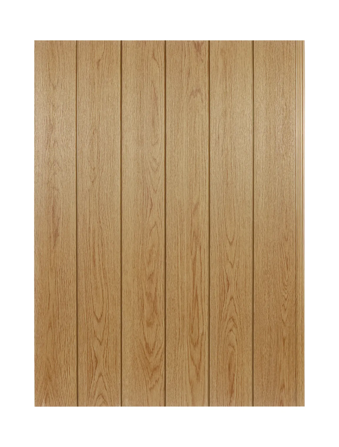
Photographs of the actual boards in this colour. Tap any swatch to move through the range.
Where Golden Beech sits in the six.
| Colour | Value | Temperature |
|---|---|---|
 Pale Oak Pale Oak | Lightest | Cool neutral |
 Ash Silver Ash Silver | Light to mid | Cool grey |
 Golden Beech ← you are here Golden Beech ← you are here | Light to mid | Warm golden |
 Honey Teak Honey Teak | Mid | Warm honey |
 Smoke Grey Smoke Grey | Mid to dark | Warm grey |
 Coffee Walnut Coffee Walnut | Darkest | Warm dark |
Three distances, three different colours.
The same board reads differently at arm's length, in the hand and from across the street. Look at all three before you decide — most disappointments with a timber-effect facade come from judging only one of them.
The surface you touch
A golden amber ground with the widest swing between lit and shaded grain lines in the range — the pore lines are distinctly darker than the ground and the figure is pronounced. It is the most 'woody' of the six at close range.

The board in your hand
A single Golden Beech board against the light. The swing between the lit grain and the shaded grain is the widest of the light tones, which is what makes it read as oiled hardwood at arm's length rather than as a wood-effect print. It also means this board changes more than any other when the sun goes behind cloud.
The wall at twenty metres
The same boards installed. At this distance the grain figure largely disappears and the value takes over: a warm golden field that reads as fresh timber. It survives the distance better than a high-contrast dark board, which is the trade you are making when you specify the brighter of the warm tones.
How Golden Beech behaves as the light changes.
This board has the most colour in the range to give away, so it responds to the colour of the light more than any other tone here. Worth reading before the elevation orientation is fixed.
At arm's length
A golden amber ground with the widest swing between lit and shaded grain lines in the range — the pore lines are distinctly darker than the ground and the figure is pronounced. It is the most 'woody' of the six at close range.
As the light moves
It has the most chroma to give away, so it responds to the colour of the light more than any other tone here. Low warm sun at the end of the day lifts it; overcast flattens it to a matte honey; in deep shade beside a blue-grey wall it can read orange. That last one is the risk to design around: keep it away from large cool grey or blue planes unless the contrast is deliberate.
At twenty metres
At twenty metres it blocks as a warm golden field and reads as fresh timber. The grain figure largely disappears and the value takes over, which is why the tone survives distance better than a high-contrast dark board.

Six real sections, one lighting setup — the only honest way to compare two tones.
Horizontal or vertical
The grain runs along the board, so rotating the layout through 90 degrees rotates the figure with it, and changes the elevation more than the colour does. Horizontal boards make an elevation read wider and lower; vertical boards make it read taller. Decide it before the lengths are ordered.
In depth: Golden Beech.
Matching an existing oiled hardwood deck
Golden Beech matches freshly oiled hardwood more closely than it matches weathered timber, which is the opposite of what most people expect from a wood-effect board. If the specification is being written around a deck that has just been oiled, a hardwood soffit or an existing teak balustrade, this is the closest of the six and the match will hold for the first few seasons of the deck's life - after which the timber moves and the cladding does not.
The only reliable way to confirm it is to hold a section of the actual FV01 or FV02 profile against the timber you are matching, in the light the elevation actually gets, and to do it before the order is placed. Screen images are not a like-for-like comparison and neither is a render. The board is the same across all six colours - it is the surface that changes - so matching a tone does not change anything else in the specification.
The shade problem: what happens when a warm tone meets a cool background
A warm, saturated surface seen against a cool background in low light will read more orange than it does in sun. That is how colour perception works rather than a property of this product, and it applies to real timber with the same ferocity: a cedar wall in a shaded courtyard beside a blue-grey neighbour will look more orange than the same cedar on a sunlit elevation.
The fix is context, and it is decided early. Pair Golden Beech with warm neutrals - sand and cream render, brick, bronze anodised frames, dark hardwood - and it stays golden. Set it against large cool-grey or blue planes and it will argue with them unless that contrast is the point. If the elevation sits in permanent deep shade and the brief is a warm tone, Smoke Grey or Honey Teak will hold up better than this one, because both start further from the orange.
Where warm mass works: gables, canopies and hospitality
The tone most often specified when the brief says timber without qualifying it. It carries a gable end or an upper floor above a lighter base, and it holds up in the deep shade of an entrance canopy better than the cooler tones do - a warm surface has more colour left to give away when the light drops.
In low-rise commercial work it is the tone that makes a building read as hospitality or retail rather than as industrial, which is usually the whole reason a client asks for timber in the first place. Around a pool it benefits from the warm light reflected off water, and it pairs with timber battens, hardwood trims and louvre runs more easily than either grey does. Where the elevation is long and evenly lit, this is a tone that can be used at scale without becoming monotonous - the grain is pronounced enough to hold at arm's length as well.
Where this tone family is already specified.
Golden Beech is read here against the teak group in our project file.
| Market | What the project file records |
|---|---|
| SerbiaEurope | Teak co-extruded wall cladding, several project sets, one of them teak + walnut two-tone |
| CanadaNorth America | SP-WP11 and SP-WP08 teak cladding |
| United StatesNorth America | SP-WP14 + SP-WP03 teak, wall cladding and exterior ceiling |
| New ZealandOceania | SP-WP14 teak |
| BelgiumEurope | SP-WP14 teak |
| BahrainMiddle East | SP-WP03 teak |
| EgyptAfrica | SP-WP11 teak and a first-generation WP03 set |
| BrazilSouth America | SP-WP12 teak |
| PhilippinesSoutheast Asia | WP03 teak |
| Taiwan, ChinaEast Asia | SP-WP03 teak |
How to read that table for Golden Beech
Golden Beech belongs to the teak group, which is the most recorded tone group in the project file - ten markets, from Serbia and Belgium through Canada, the United States, Bahrain and Egypt to New Zealand, Brazil, the Philippines and Taiwan, China. That is a record of the family, not of this exact tone: the ledger records the profile and the market, not the pigmentation code. What it does establish is that a warm golden-brown wall cladding is a specification that travels across very different climates, which is the useful part if you are writing the specification for a market you have not sold into before.
Every row above is a folder in the project photo file for the MexyTech co-extruded wall system that FV01 and FV02 are engineered on. It is not a claim that these installations used FV01 or FV02. The ledger records the profile and the market, not the pigmentation code, so the rows are grouped by tone family.
Where Golden Beech is used.
Residential facade
The tone most often specified where the brief says 'timber' without qualifying it.
Entrance walls and canopies
Holds up in the shade of an overhang better than the cooler tones.
Gable ends and upper floors
Warm mass above a light base.
Low-rise commercial
Where the building has to read as hospitality or retail rather than as industrial.
Pool houses and covered terraces
Warm light reflected off water suits it.
Signage and joinery pairing
Sits with timber battens and hardwood trims more easily than the greys do.
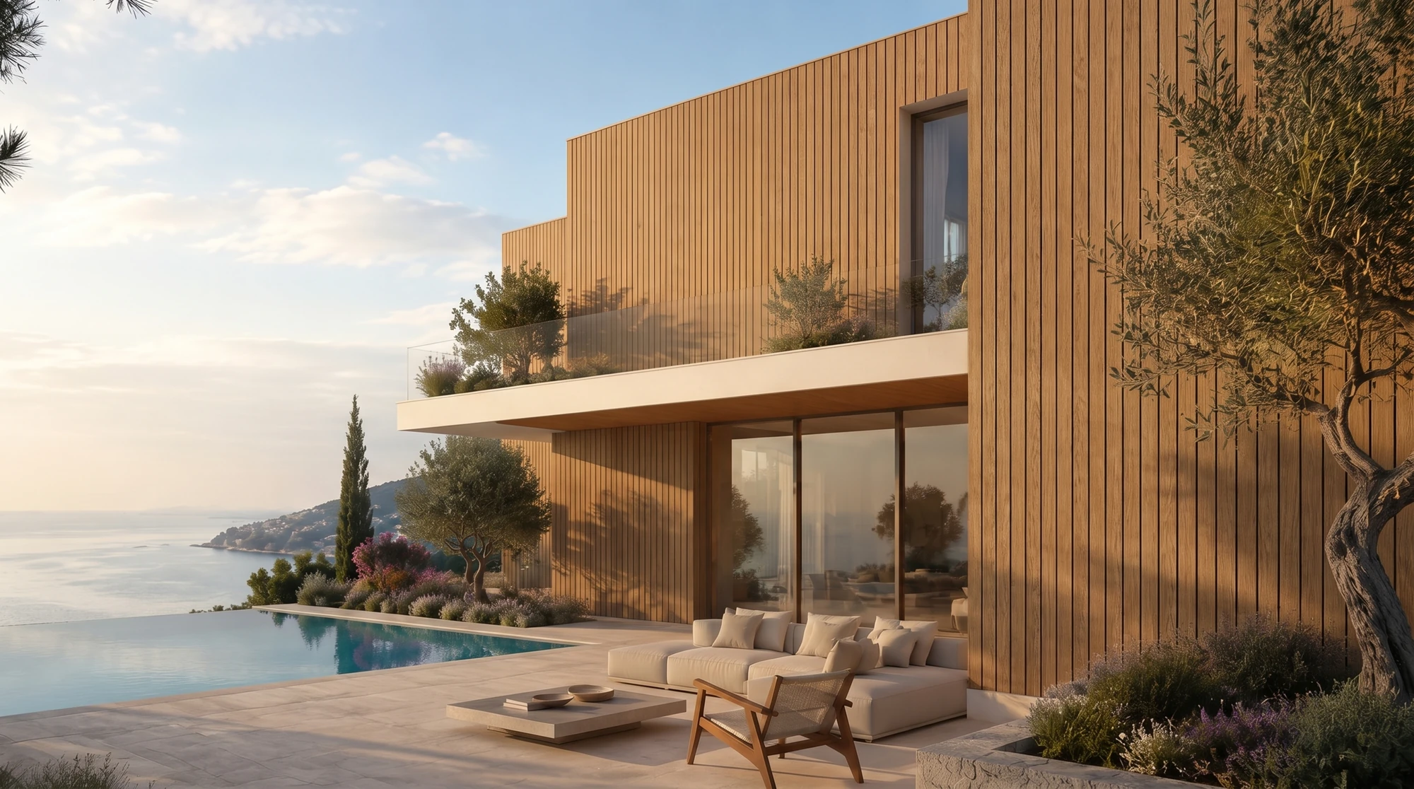
Concept visualisation: a golden-toned facade in low, warm light. This is a design impression, not a photograph of an installed FlowVeins project.

The section is the argument: a fourth-generation WPC core, a composite ASA surface cured into it, and an interlocking edge that takes the screw without a visible fixing.
What Golden Beech sits beside.
Smoke Grey for a warm-over-neutral two-tone; Pale Oak for a soft tonal gradation within the warm group. Outside the range: white or sand render, brick, dark hardwood, bronze anodised aluminium.
Specification.
A saturated surface changes nothing structural: same core, same ASA layer, same pre-punched fixing, same warranty. The table below is the board, not the colour.
| Profiles | FV01 178 x 15 mm · FV02 223 x 25 mm |
|---|---|
| Exposed face | FV01 150 mm · FV02 195 mm |
| Construction | Fourth-generation WPC core with a composite ASA surface, cured together in the molecular crystal curing stage |
| Fixing | Patented pre-punched male end, screw-fixed to battens |
| Length | 2.9 m standard, custom within 3.0 m |
| Colours | Six standard colours, combinable in one container load |
| Warranty | 10 years, coverage scope subject to the formal warranty statement |
| Chain of custody | FSC® ESTS-COC-240458 |
| Fire | EN 13501-1 B-s3, d0 — tested on a 26 mm specimen, screw-fixed to a substrate, 40 mm ventilated cavity, no joint |
| UV / weathering | 3000 h QUA ageing report for the ASA surface, SDHL2407013318HI |
| Surface reference | The signed physical sample governs production, not any screen image |
Fire classification is quoted with its specimen build-up. FV01 is 15 mm and FV02 is 25 mm, and the classified specimen was 26 mm — confirm the required build-up against your project.


Choosing between two close tones.
Golden Beech vs Honey Teak
Same family, one step apart. Golden Beech is lighter and more saturated; Honey Teak is a browner, deeper honey and is the more common specification of the two. On a large elevation in strong light, Golden Beech is the brighter read; in a shaded courtyard the difference narrows.
Golden Beech vs Coffee Walnut
Not adjacent — four steps apart in value. Choosing between them is choosing whether the facade is light or dark, not choosing a shade.
Questions buyers ask about Golden Beech.
Will the delivered colour match the photo on this page?
No, and no supplier can promise that. Grain direction, the angle of the light and the production batch all shift what the eye reads, and a screen adds its own colour cast. Every colour is supplied as a physical section of the FV01 or FV02 profile you are specifying, and the approved sample is the reference production is held to.
Does it fade or grey off the way timber does?
ASA is chosen for facades because it holds colour under UV. The 3000 h QUA ageing report for the ASA surface is SDHL2407013318HI. Colour retention is projected to exceed 20 years of outdoor exposure — a test-based estimate, not a warranty period. The commercial warranty is issued separately and is shorter by design: 10 years.
Is it fire tested?
EN 13501-1 B-s3, d0 was classified for a 26 mm specimen, screw-fixed to a substrate, with a 40 mm ventilated cavity and no joint between specimens. The classification applies to that specimen build-up; FV01 is 15 mm and FV02 is 25 mm, so use the tested build-up as the reference and confirm the requirement against your project.
What is the minimum order?
Half a container per colour. The six standard colours can be combined within one container load, but each colour ordered has to meet its own minimum.
Will it look orange in shade?
A warm, saturated tone seen against a cool background in low light will read more orange than it does in sun — that is how colour perception works, and it applies to real timber too. The fix is context: pair it with warm neutrals, and if the elevation sits in permanent deep shade, look at Smoke Grey or Honey Teak instead.
Does it match natural timber?
It matches freshly oiled hardwood more closely than weathered timber. If the specification is written around an existing oiled deck or a hardwood soffit, this is the closest of the six, and the way to confirm it is to hold a section of the actual profile against the timber you are matching.
Put Golden Beech in your hand before you specify it.
If you are matching an existing deck, soffit or joinery, send us a photograph of the timber as well as the brief. The sample that comes back is cut from production board, not cast as a colour chip, and the signed sample is what production is held to.
- MOQ
- Half a container per colour
- Lead time
- 30 days after order confirmation, standard colours
- Combining
- All six can share one container load

Samples are cut from production board, not cast as colour chips — so the grain, the sheen and the edge you hold are the ones you will receive.